It seems that fashion brands not only follow textile trends, but also graphic ones. In the same way that clothes in the stores have less and less personality and all of them follow the same line, in the graphic design and corporate identity of such firms something similar happens, and we attribute it to the same factor: the fear of risk.
The fear of risk makes that there’s less and less innovation in graphic design and corporate identity of these brands, so all of them end up looking alike and losing pregnance.
Big fashion brands like Burberry, Yves Saint Laurent or Balenciaga have a huge media and competitive pressure, and with good reason: they’re in the spotlight, being reference brands in the textile sector. Because of that, they must know how to make their graphic identity different from their competition to be leaders, but staying on track with all the points of parity that all the market accomplishes. However, this fear of risk makes that there’s less and less innovation in graphic design and corporate identity of these brands, so all of them end up looking alike and losing pregnance. 
Historically, logotypes of big clothing corporations have always been pretty simple, black and white, mainly legible. Nevertheless, each brand had one typography that made it unique and different from the rest, some more baroque and others much more simple. The new trend, however, has made that all the fashion brands move to sans-serif typographies, bold, uppercase and black and white. As they don’t have an image type either, and many of the include the city of origin underneath, brands like Berluti and Balmain look like taken from the same place. Like this, giants of the textile world like Calvin Klein, Gant, Céline, Burberry, Paco Rabanne and Balenciaga, among others, seem subdivisions of the same brand.
Although these redesigns are signed by big graphic professionals such as Peter Saville, it looks like they haven’t been able to contribute with anything else than that: their signature.
Another decisive element in the redesign of fashion brands is the change of the creative direction. In the case of Balenciaga, the rebranding was generated due to the landing of a new creative director in the company. Lacking deeper knowledge about graphic design and with a communication strategy focused on other things, probably a lot of creative directors just follow the flow of the trends without really worrying about what the graphic identity says of their brand. Although these redesigns are signed by big graphic professionals such as Peter Saville, it looks like they haven’t been able to contribute with anything else than that: their signature.
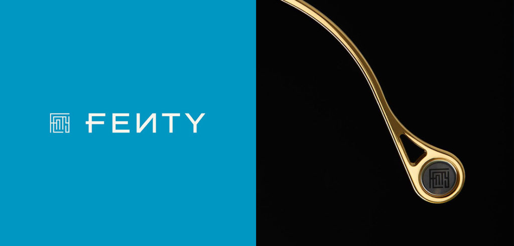
In the case of smaller or recently-created brands, the risk is pretty good. For example, Fenty is a fashion brand created this year by Commission. This young brand uses the blue colour, and even though the typography is pretty simple, it has some peculiarities such as the F or the reversed N, and also the image type that combines all the letters as a labyrinth. This makes that the brand has a lot more personality and recognition than any other.

Another case we consider successful, this time a redesign, is The Danes New York, a minimal clothing brand. With another sans-serif typography, this brand combines black and grey, and it places the text aligned to the left, tracing a black line that crosses the whole logotype matching the diagonal stick of the N in the “Danes”. The result is a simple graphic universe, but with a lot of personality and recognition.
Last but not least, another brand with groundbreaking branding aligned to its values is ZOA. This brand creates a logotype based on three geometrical figures: a divided square for the Z, a circle for the O, and a divided triangle for the A. With this simple logo, that ultimately plays with the dialectic law of the Gestalt (shape and background), the brand gains a lot of communicative strength and a unique identity.
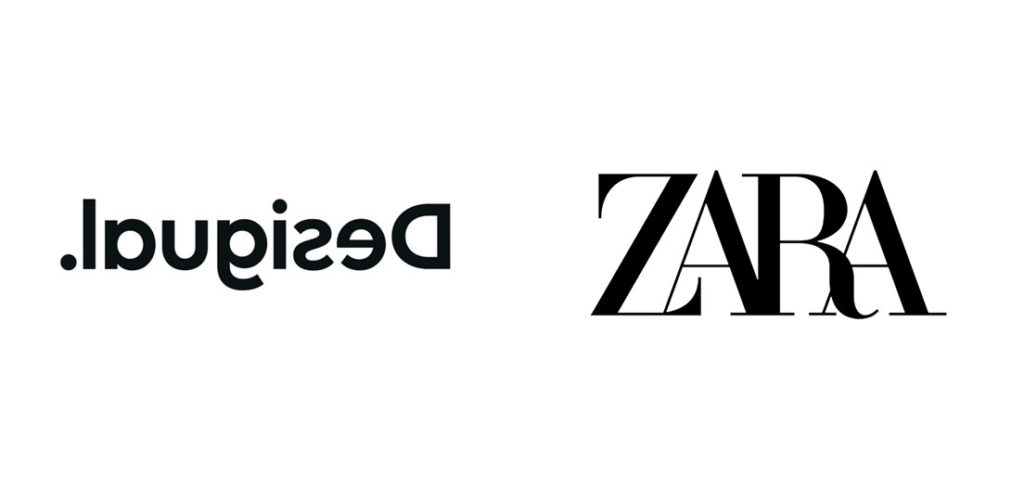
Risking, however, is not always the best option, because you can overstep. It’s the case of brands like Desigual, that has released a new logo with the reversed logo, or Zara, that has put all the letters together in a pretty tight kerning. Both of them break the basic graphic design rules like the legibility, and they stop being functional for being too risky.
 As the saying goes, virtue is the happy medium between two extremes. If fashion brands achieve to find this aurea mediocritas when managing their graphic design, they can get to be leaders in trends, and not only in dresses or blazers. The key? Meaningful risk.
And what do you think about it? Leave us a comment.

