Today we were reading the press, and we saw an article in the ABC newspaper in which they talked about a possible candidature of Barcelona for the 2030 Olympic Winter Games. Although it’s not confirmed, the intention was implied in the celebration of the 25th anniversary of the 1992 Olympic Games.
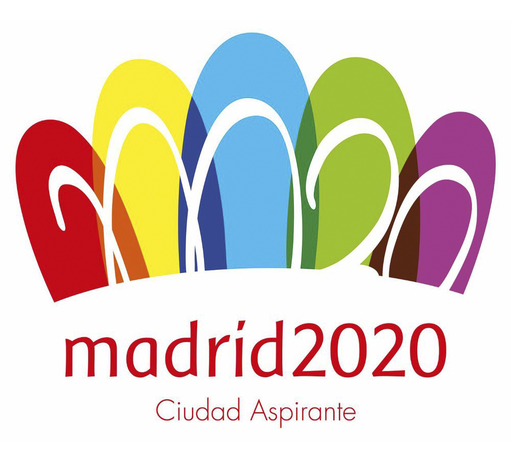
This has lead us to remember the polemic there was with the Madrid 2020 candidature logotype. If you remember, the logo was decided by a competition among design students. The winner was Luis Peiret, from Zaragoza, who made this prototype and won 6000€ and the chance to collaborate with the image of the candidature.
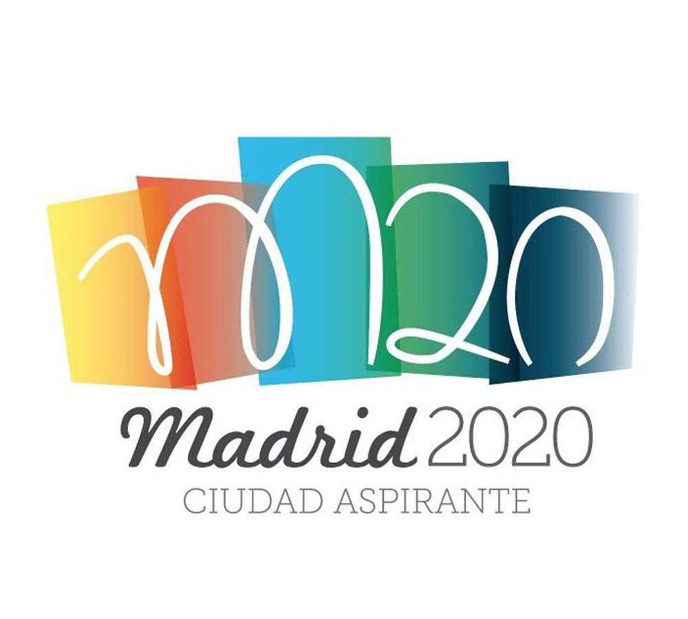 Then, however, the logotype was retouched by the advertising agency Tapsa. They broke with its angular nature to simulate the Alcalá Gate and its 5 arcs, and they also changed the typographies and used a pink colour instead of black. The definitive logotype was this:
 The change had a very bad reception because of several reasons: avoiding the black colour, they obviated the African continent (breaking with the meaning of the Olympic rings), the used typography fomented a bad lecture of the word Madrid (which seemed accented), and the worst: the cut white text created an optical illusion, which lead people to think there was a 20.020 instead of a M20, in a logo which already seemed a row of flip-flops. The internauts made lots of jokes and this caused the agency to justify their graphic decisions (without much success, though).
With all that, we want to make an important appreciation about the graphic design as a discipline. In our opinion, design is an ambit which must withstand a lot of intrusion, because as soon as someone has basic notions of design programs, already defines oneself as a designer. All of this injure both the professional designers (who see their jobs jeopardised) and the clients themselves (who suffer a loss of quality in the works). In the example we put, it’s very clear: if ordering something as important as a city graphic identity to some students is an unwise decision, letting an advertising agency (non-specialized in branding consulting) to retouch it is even worse, as you can see in the result.
On the other hand, if anyone can be a designer, anyone can be a design critic. It’s the case of many poster and logotype contests, in which the tribunal is composed by people who haven’t anything to do with the field, and appreciate some works above others under an aesthetical approach and a personal preference without any kind of justified base, which leads to injustice and results manipulation. Perhaps the main reason of this happening is the lack of theorisation and visual education which we are subjected to in our learning process.
These things only send the message that graphic design is something simple and banal, that has none theoretical basis whatsoever and that therefore it’s open to everybody and it’s not so important, and make this sector increasingly unprofessional. As we always say, the graphic identity is always necessary to define oneself and, because of that, from Crece we claim the importance of relying on professional designers rather than trusting anybody who has some knowledges, in the same way you don’t turn to a vet to have surgery.
So, we defend the idea that each one does what knows best, always fully aware. As the saying goes, the cobbler should stick to his last.
And remember: if you want to create or modify your graphic identity or your business one, you just need to contact us. We’ll be pleased to help you!