Some days ago there was a lot of discussion due to a rebranding of the Pepsi’s logo made by a user, that we posted on our social media. Controversy was generated, because some people liked it but some found it horrible. This debate made us think about an interesting topic to discuss in the blog: the influence of the users in the rebranding of brands.
It’s no secret that the user-generated content or UGC has been a trend for some years now, and even more with the rise of Internet and social media to spread it. Basically, the UGC is the proof that users are willing to express themselves and demonstrate their loyalty to the brand, sometimes with the objective of promote themselves as professionals and show their work, which brands end up buying sometimes. In some occasions, these rebrandings aren’t noticed, but if one is quick or chooses a logo that hasn’t been redesigned for a while to make a new version can achieve some media awareness out of the polemics.
There are other times in which brands carry out a rebranding that doesn’t fulfil the expectations, and users take no time to make their own version to criticise this work with a parody or an improvement with a serious design. Most of these projects of rebranding need some time and effort, and that’s why we want to gather some. The influence of the users in the rebranding of big brands can come from two different ways:
1. Rebranding versioned by users.
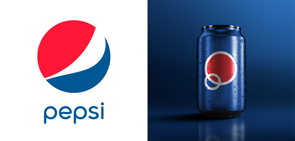
As we say, sometimes users develop on their own rebrandings for several reasons. For example, the Pepsi case had an academic purpose. This redesign tried to transmit new messages keeping the same brand essence: the two circles form the P of Pepsi, the idea of bubble, the traditional logo, two planets to transmit globalisation. In spite of having been criticised, we can affirm that the concept behind this both innovative and polemic graphic proposition has been very thought.
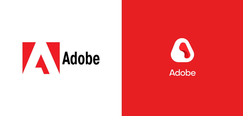
On the same line, we find multiple examples on the web of several brands, like the Google logo with the two O as the search bar or with a minimalistic typeface, the one from Adobe cloud-shaped or even the WhatsApp one changing the phone for some suggesting dots. All of them are evidence of users that believe they can improve the visual identity of our daily-life brands, and they try to do it as creative and conceptual as possible.

On the other hand, there are times in which user-generated rebrandings have a complain base and are a protest upon a non-wished or poorly-executed change. On this line, we can highlight the example of the FC Barcelona shield, which we discussed about in another blog article. The rebranding task was given to Summa, the Barcelona agency, but the result was not the expected and, after a rush of critique, the team didn’t implement it. However, other users on social media uploaded their own versions of the logo, being the most popular the one from Hyperakt, the graphic studio, that solved some problems like the disappearance of the acronym FCB and the curves of the shield, and it was considered an improved version.

Another example of rebranding, this time as a satire, is the one they made to the Madrid 2020 logo, that we also discussed in our blog. A lot of people considered the coloured arcs to be flipflops or Pac-Man ghosts, and the parodies didn’t take a lot to come up on social media, one of them from Javier Mariscal himself.

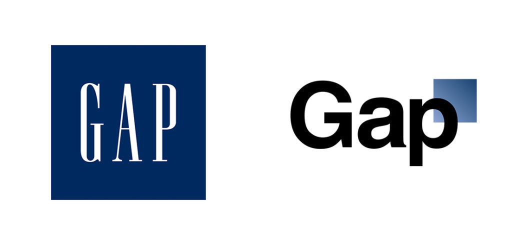
But you don’t need to make a proposition of redesign to criticise what already exists. It’s the case of the clothing brand GAP, that tried to change their logo and had to withdraw it because of the huge hate to this unexpected change and made in a hurry without asking anybody.
And, sometimes, critiques surpass the graphic area and get into the brand values area. A user posted on Behance some logotypes affected by their products, in which we can see a fat M of McDonald’s or a Nestlé with acne, among others.

2. Rebranding a concurso.
Brands take advantage of the awareness generated by users to sabe money and gain creativity. A loto f times, they generate engagement with users taking the redesign of their corporate identity to public contest. Users have the chance to make a proposition of the new logo or to vote for the one they like the most among several options, and like this they take part in the brand’s decision when changing.
An example of this is Mozilla, because as it’s a non-profit organisation it decided to keep with this transparency line and carry out the first public rebranding in which people could observe, give opinions and, the bravest, to participate giving ideas. 7 creative lines were established, and they were narrowed to 4, and finally one proposition won. This created a unique and free typography, playing with the symbols :// to create the i and the ll in the word Mozilla. Like this, all users can reproduce the logotype underlining the word with a black background. All of that came from the mind of somebody that decided to take part in this redesign adventure.

Some time later, Firefox, Mozilla’s search engine, also had to be redesigned. This time, two different graphic lines were presented, and the community decided which one suited best. This way, with the web comments, the brand made sure to know what the internauts thought of each line to know what could be more accepted from their feedback.
The same way, the logo for Tokyo to be candidate for the Olympic Games 2020 was also taken to open contest. Nevertheless, in this case it was because the original design, by Kenjiro Sano, was accused of plagiarism by other studios and after lots of critiques and polemics the Olympic Committee got rid of it in case the public would stop supporting it. Anyway, this episode help some designers and anonymous artists to have the chance to prove their talent and make it visible in such a big and media-covered event as the Olympic Games.

All in all, we can see that the participation of users in the rebranding of brands, either giving opinions, competing or simply giving new ideas, generate a dialogue space of graphic design very didactic and positive for everyone. A great brainstorming and collaboration values allow the communication and corporate identity sector to advance collectively, and the consumers/clients of the brands can feel engaged on what they’re saying. Sometimes, breaking the professional barrier can bring some surprising and satisfactory results.