
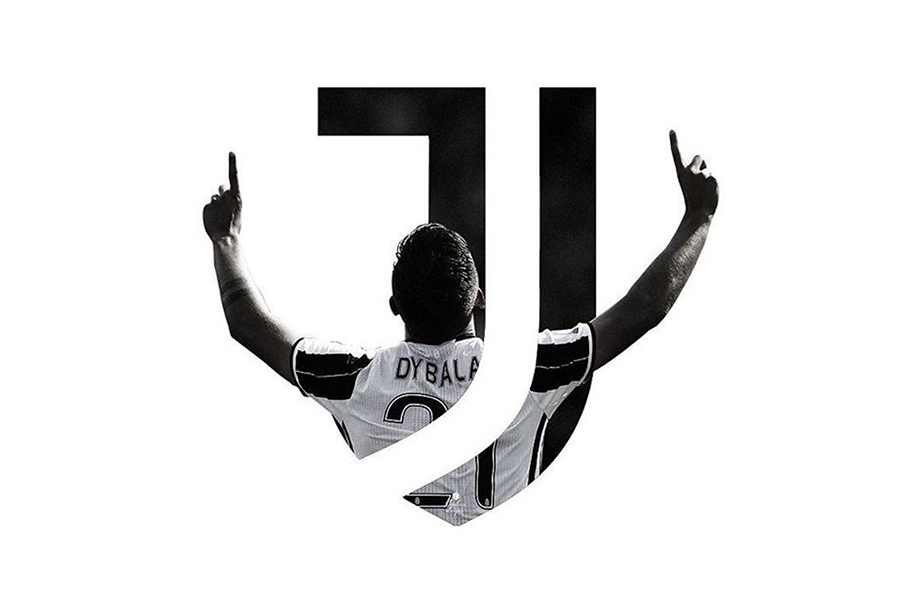
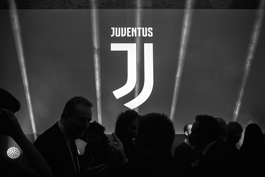


Today, in Crece Agency we want to talk about logotypes, and more specifically about sport logotypes. In a “20 minutos” article, we’ve read that the football equipments of this season have been published. One of them that we want to highlight is the one from the Juventus Football Club, that this year launches the logotype presented last January. And as with any unexpected change, the controversy is served.
The new shield, designed by Interbrand, collects in a very synthetic way all the Juventus’ identity: it plays with a shield shape (to continue with the heraldic tradition), with the black and white bars (typical of the team), and with the J (the team initial). And to avoid losing identification, it also includes the whole name of the team on the top of the symbol.
This new identity has caused a big divergence of opinions, mostly negatives to the change. The team enthusiasts reject the new shield, alleging that it implies a loss of identity and the traditional values of the team. To sum up, they believe the team has lost strength and they don’t feel part of the change it has experimented.
The rejection is such, that has led some internauts to mock the new shield, comparing it and looking for similarities and plagiarisms in other logotypes. Casually, one of the logos which the new Juventus shield has been compared with, is the popular Jorge Lorenzo’s “1”, created by one of our designers: Ciscu Gómez (you can see it more detailed in our web’s section “Our works”). This comparison has been so popular that has appeared in one article in the sport newspaper As.
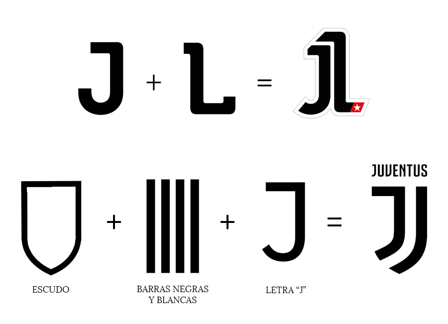
The similarity relapses in the combination of two black elements which create a third one. In the case of Juventus, the J with black and white bars make a shield. With Jorge Lorenzo, his two initials (J and L) make the number 1. Nevertheless, in Crece we claim the difference presented by the two logos, because they have such different backgrounds and they’re only associated because of the use of typography and the easiness of the simple, and we flatter the job done by Interbrand in the new Juventus’ identity elaboration.
Another team which has suffered a similar polemic recently is the Atlético de Madrid. This one, like Juventus, has made a change in its shield to simplify the shapes and to make it more understandable. The enthusiasts have soon showed their rejection, but in this article from Brandemia, Modesto García explains the 12 reasons why we must accept the new logotype, refuting all the accusations made by the Atlético fans.
With the generated controversy, we want to take the opportunity to talk about an evolutionary trend of the graphic design, increasingly widespread in the football world: the simplification of the teams’ shields, which turn into logotypes. The graphic design boom and the onset of merchandising and digital world require an easy adaptation of the corporate identities to any support if necessary, and therefore they bet on simplicity and concretion in a world overloaded with visual stimulus to remember. Currently, brands have become a core of meanings and values, and they’ve gained so many importance in storytelling and the oneself definition, that a good logo which vertebrates everything is vital. So, we bet on the minimum expression in corporate identities, because sometimes, as we know, less is more.