It’s no longer a surprise that many commercial brands from very diverse sectors are following the trend of simplifying their logos and corporate images with the aim of making them scalable to new formats and smaller and smaller applications. However, there are still some sectors that are more reluctant than others to follow this new graphic design trend, such as the football and automotive sectors, which we will talk about today.
A few years ago, in 2017, in this blog we talked about motoring companies and their overloaded logotypes. In that article you could see how, in their origins, a large number of automotive brands such as Chevrolet, Ford, Fiat or Renault, had flat logos in one or two inks. However, since the technological revolution and the rise of computers, all these brands quickly joined the trend of experimenting with all the options that design tools offered.
The result was a fanfare of motoring logos full of volumes, metallic textures, three-dimensionality, shine and effects that looked like their physical representations on car sheet metal, possibly in search of greater client recognition and a more avant-garde image.
Since the technological revolution, brands have joined the trend of experimenting and taking advantage of design tools to give their logos a more avant-garde image.
If we move to the present day, we can certainly say that the trend has moved in the opposite direction.
Most of the brands we know have already taken the step of simplifying their logos as much as possible, eliminating all traces of metal, shine and three-dimensionality, and recovering in some way the essence of their origins without so much ostentation. We are talking about brands such as Renault, Peugeot, Nissan, BMW, Volkswagen, Ford, Opel, Honda, Hyundai… And even luxury brands such as Jaguar and Aston Martin have also joined the minimalist trend.
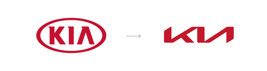
 Even some brands, such as KIA, have not been satisfied with simply eliminating reliefs and textures, but have taken the opportunity to radically change their image, their claim and their entire sales strategy.
 On the other hand, motoring companies such as Lexus or Mercedes-Benz, despite having presented a redesign of their logos in one ink without any relief, still use the metallic version of their logos in certain applications. This hybrid in their corporate visual images may cause confusion among their users, but it is a timid approach from these brands to simplicity. We hope that they will soon make the big leap and leave their obsolete versions behind.
 And if these brands are finding it a little difficult to take the plunge, there are others that are not even considering changing their image and are defending their reliefs and three-dimensionality tooth and nail. We are referring to brands such as Alfa Romeo, Cadillac, Chevrolet, Porsche and Mazda.
 As we have already mentioned in an article on redesigns and trends in 2017, we believe that it is very difficult and also a mistake to try to establish patterns to follow between brands as different as the automotive brands. Not all trends fit all brands, as each one has its own positioning, values and personality that tries to be unique and different from the rest. However, in today’s highly digitalised world, it would be a lie to say that we do not support the trend for simplicity.
We believe that the future of graphic design and branding will involve the search for logos that can be easily reproduced in as many different media as the years go by. In the case of the automotive sector, a logo designed 30 years ago to be used only on cars and printed on magazines is now probably obsolete.