Once again, in today’s article we’re going to talk about logotypes. Remembering one conference our designer Ciscu gave in the Open Week Barcelona, where he made his own logotype classification, we’ve thought it would be interesting to share it with the readers of the blog.
As we know, a graphic designer usually has a personal style when designing and elaborating projects. While it’s true that a designer must be open-minded to new inputs and trends and must nourish with external material like cinema, music, or art to get inspired, he or she shouldn’t base the whole creation in external influences, because that will lead to the obtaining of aesthetically correct logos, but very meaningless. This takes us to talk about the first type of logo: the empty logotype.
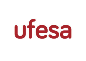
The empty logotypes, as their name implies, are logotypes which have no personality, and don’t transmit the brand identity, harming it. An example can be the remade logo of the enterprise Ufesa, which was described as something fresher, younger, closer, and innovative, when the only change done was using a rounded typography, justified with a speech to muddle through.
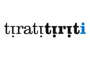
 Another type is the logotype with history. The logos with history have a concept behind, one little story which is not always known by the receiver, but that adds value to the brand. A pretty good example is the logo of the restaurant Tirati Tiriti in Tiana, of our own. The owner’s grandfather was a swimmer, and when in winter it was cold and he didn’t want to touch the water, his mates told him “Tira-t’hi!”, which is “Jump in!” in Catalan, and he had this nickname, Tiriti. The “i” of all the logo symbolise people who has already jumped in, except for the last one: Tiriti, who’s still standing.
 The last type of logo is the logotype with spark. These logos that have something peculiar and different that characterising them, something hidden or unique. For example, the FedEx logo, which hides a white arrow between the E and the X, or the Carrefour one, which hides a white C in the middle. Without hiding anything, the Roger Federer logo transmit the brand in a very simple way, but serious and elegant.
 In conclusion, we can say that logotypes are ambassadors of the philosophy and personality of the brand they identify, so you have to take them seriously. As a tip, we say that it’s necessary to lose touch with design to design better, i.e. avoiding the aesthetics for aesthetics’ sake and to achieve functional and representative logos.