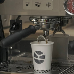
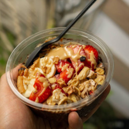
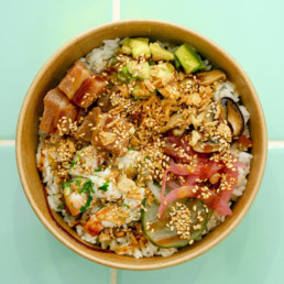
Kope Poké is a new café concept in the city of Badalona, Barcelona. Located on the Avenida Martí Pujol, next to the beach and the train station, Kope Poké offers a wide variety of healthy poke bowls to take away, as well as an exclusive selection of coffees.
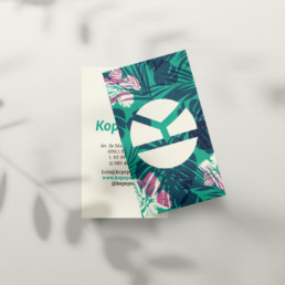
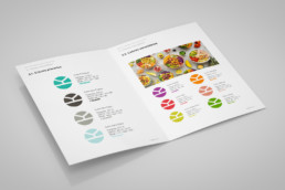
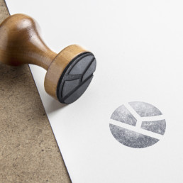
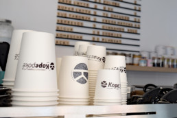
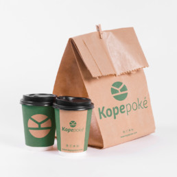
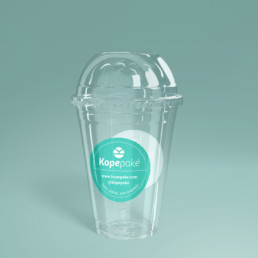
For this client, at Crece Agency we designed the entire corporate visual image from scratch, as well as the naming and the identity manual that includes the logo with all its variations and the different graphic applications depending on the format. The graphic applications we have designed include the packaging for the coffees and take-away bowls, business cards, loyalty cards, the menu, stamps and stickers.
For Kope Poké we also designed a unique texture based on the company’s philosophy and tone, using their corporate colours to give strength to the brand image, and following the Hawaiian aesthetic that represents the origin of this establishment’s style of cuisine.
The naming Kope Poké brings together its two main commercial elements: kope, which in Hawaiian means coffee; and poké, which literally means to cut, and names one of the most typical dishes in Hawaii, the poke bowl, a healthy dish of fresh fish, sushi rice, and different toppings and sauces to choose from. The combination creates a unique name with great personality.
The imagotype uses the graphic resource of the optical illusion by using the most characteristic letter of the brand, the K. The circular shape with the K horizontally has a double representation. On the one hand, it symbolises the zenithal view of a poké with its different elements and, on the other hand, the logo represents a poke bowl seen from the front with two chopsticks on top.