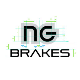
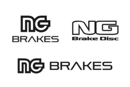
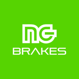
NG Brakes trusted Crece Agency for the redesign of their entire corporate identity, including their naming, changing from “NG Brake Disc” to “NG Brakes”. The objective of this change was to continue evolving the brand to reach new markets, while at the same time maintaining the essence of the company founded in 1969.
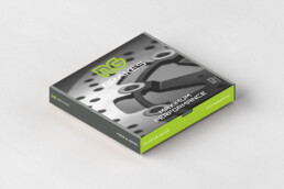
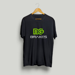
The new corporate identity of NG Brakes represents a natural evolution that has been developing in recent years, and aims to simplify and improve readability by reducing graphic elements. It’s worth noting that the characteristic green color of NG has a greater presence in all graphic applications.
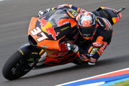
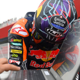
The geometric shapes of the logo are inspired by the world of motorcycles, specifically in motorcycling. The shape of the letter “N” is inspired by the silhouette of speed bikes, while the shape of the letter “G” resembles the structure of a brake kit.