
Since the invention of writing, humans have sought to simplify it as much as possible, creating universal systems with easily recognisable characters and thus speeding up the process of writing and reading. As you know, at Crece Agency we are passionate about experimental and groundbreaking typography. After an interesting investigation, we found an avant-garde typographic trend not yet explored in our country (nor in our language): the gender inclusive typography.
Inclusive language has been a subject of controversy over the past few years in Spain. On several occasions we have seen the RAE (Real Academia de la Lengua Española) take a stand against the expressions of inclusive language that have emerged over time and whose use continues to spread. We are talking about the use of “@”, “x” and “e” for neutral plurals in Spanish.
The RAE seems to be clear on this: «the inclusion of the double gender, i.e. ‘todos y todas’, is considered unnecessary, as is the use of ‘inclusive language’ which uses ‘x’, ‘@’ or ‘e’ instead of the plural, i.e. ‘todxs’, ‘tod@s’ or ‘todes’».
Despite having expressed their opinion on several occasions, Internet users have paid little attention to the statements of the Real Academia de la Lengua Española, and we are going to do exactly the same.
The need to create inclusive, gender-free languages in certain languages is growing in a society that struggles for visibility and gender equality. For this reason, we’re not surprised that some people have already started to look for solutions outside the linguistic approach. Has no one thought of an approach from a typographical point of view?
Actually, someone has. A Swiss student named Tristan Bartolini has designed a typography with more than 40 new symbols in favour of genderless writing, a project for which he has been awarded the Prix Art Humanité by the Geneva Red Cross, an award that recognizes ideas that combine artistic spirit and humanitarian commitment. This experimental typography provides a graphic solution to the problem of gender duality in French grammar by combining two or more letters in the same character.
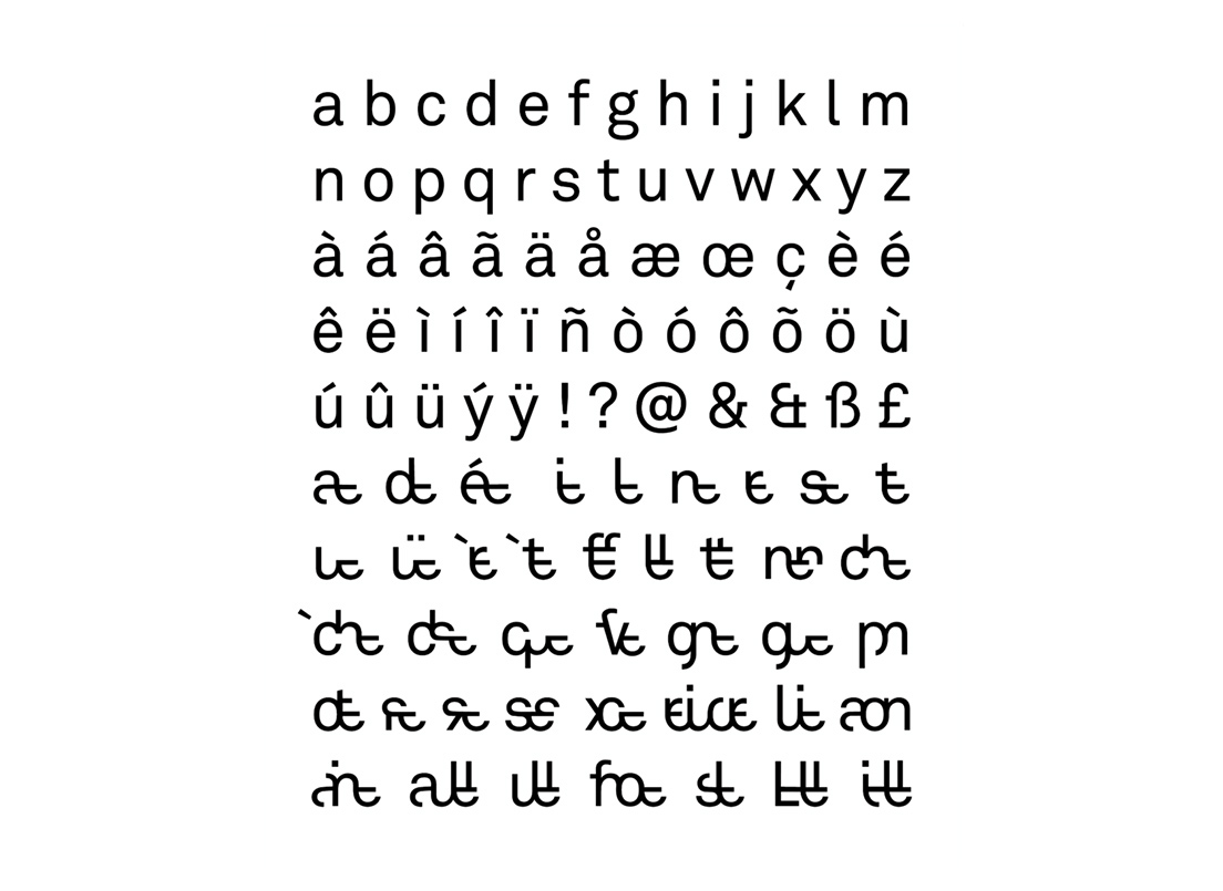
At Crece Agency we have wanted to do our bit in the search for a genderless writing system. Inspired by Bartolini’s project, “L’inclusif-ve”, our designer Ciscu Gómez has created our own version of a gender-inclusive typography in Spanish. While Tristan contributed his vision from the artistic side, we have based the design of these new characters on a system of orthographic ligatures to make them as easy to read as possible and to economise their writing. In other words, we have subordinated the aesthetics to the functionality of the new symbols. The typographic sample we have used is the Museo Font from Exljbris Font Foundry, a simple typography, easy to read but with very original serif-shaped finishes that make it unique.
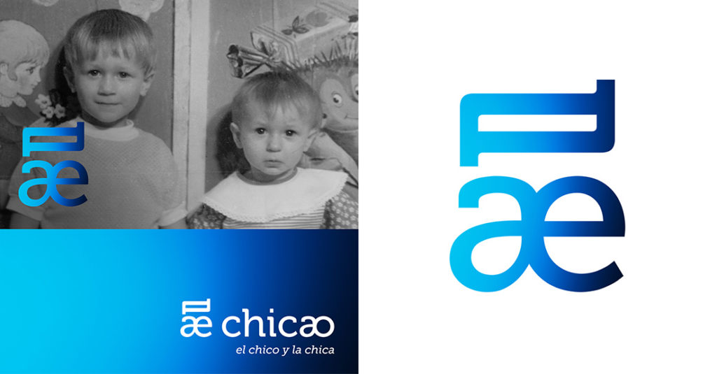
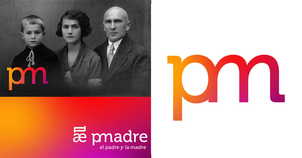
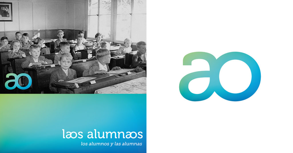
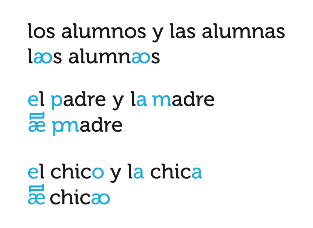
Following this design line, we have created three new symbols that respond to three gender inclusion needs that we consider fundamental in the Spanish language: the character “el/la”, the character “a/o” and the character “p/m”. The three symbols seek to combine the masculine gender with the feminine gender in a way that economises on language but without making the feminine gender invisible, as sometimes happens when we say “los padres” (the parents), when we are actually referring to “el padre y la madre” (father and mother) or even “las madres” (two mothers).
Spanish is a strongly gendered language. It’s a challenge for designers to try to provide inclusive graphic solutions that are also aesthetically pleasing, trying to find more functional and serious alternatives than the usual “x”, “@” and “e”. This is only a proposal that we make from our agency, an experimental typography that tries to respond to a graphic and social need that is increasingly present.
We cannot force the evolution of the alphabet overnight because, like the evolution of language, it’s an organic process that must occur naturally through its use. A good example is the Braille alphabet, which was designed by a young blind man, Louis Braille, in view of the need to make Barbier’s system more functional and intuitive, which is the one used until then to teach blind people to read. Barbier’s system was ingenious, based on a good idea: to generate a writing system that would allow French soldiers and officers to write and read encrypted messages in the dark and to be able to decipher them with their fingers. However, Braille perfected its design and made it accessible and functional for everyone.
As happened with the Braille alphabet, we are convinced that over time and with practice, new proposals for universal writing systems will emerge, such as this gender-inclusive typography.